# Model Comparison

# Create comparison dataframe
comparison_df = pd.DataFrame({
    'Metric': ['Training R²', 'Test R²', 'Training RMSE ($)', 'Test RMSE ($)', 'Test MAE ($)'],
    'Polynomial Regression': [
        f"{train_r2_poly:.4f}",
        f"{test_r2_poly:.4f}",
        f"${train_rmse_poly:,.2f}",
        f"${test_rmse_poly:,.2f}",
        f"${test_mae_poly:,.2f}"
    ],
    'Random Forest': [
        f"{train_r2_rf:.4f}",
        f"{test_r2_rf:.4f}",
        f"${train_rmse_rf:,.2f}",
        f"${test_rmse_rf:,.2f}",
        f"${test_mae_rf:,.2f}"
    ]
})

print("="*70)
print("MODEL COMPARISON: POLYNOMIAL REGRESSION vs RANDOM FOREST")
print("="*70)
print(comparison_df.to_string(index=False))

# Visual comparison
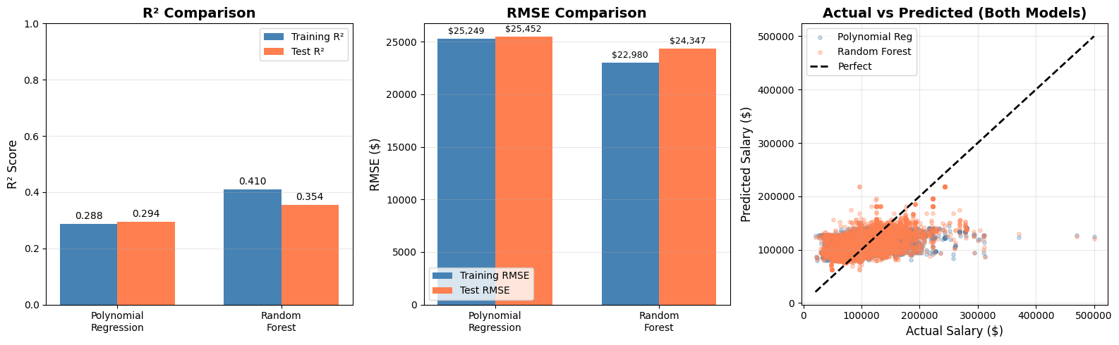
fig, axes = plt.subplots(1, 3, figsize=(16, 5))

# 1. R² Comparison
ax1 = axes[0]
models = ['Polynomial\nRegression', 'Random\nForest']
train_r2 = [train_r2_poly, train_r2_rf]
test_r2 = [test_r2_poly, test_r2_rf]

x = np.arange(len(models))
width = 0.35

bars1 = ax1.bar(x - width/2, train_r2, width, label='Training R²', color='steelblue')
bars2 = ax1.bar(x + width/2, test_r2, width, label='Test R²', color='coral')

ax1.set_ylabel('R² Score', fontsize=12)
ax1.set_title('R² Comparison', fontsize=14, fontweight='bold')
ax1.set_xticks(x)
ax1.set_xticklabels(models)
ax1.legend()
ax1.set_ylim(0, 1)
ax1.grid(True, alpha=0.3, axis='y')

for bar in bars1 + bars2:
    height = bar.get_height()
    ax1.annotate(f'{height:.3f}', xy=(bar.get_x() + bar.get_width()/2, height),
                 xytext=(0, 3), textcoords="offset points", ha='center', va='bottom', fontsize=10)

# 2. RMSE Comparison
ax2 = axes[1]
train_rmse = [train_rmse_poly, train_rmse_rf]
test_rmse = [test_rmse_poly, test_rmse_rf]

bars3 = ax2.bar(x - width/2, train_rmse, width, label='Training RMSE', color='steelblue')
bars4 = ax2.bar(x + width/2, test_rmse, width, label='Test RMSE', color='coral')

ax2.set_ylabel('RMSE ($)', fontsize=12)
ax2.set_title('RMSE Comparison', fontsize=14, fontweight='bold')
ax2.set_xticks(x)
ax2.set_xticklabels(models)
ax2.legend()
ax2.grid(True, alpha=0.3, axis='y')

for bar in bars3 + bars4:
    height = bar.get_height()
    ax2.annotate(f'${height:,.0f}', xy=(bar.get_x() + bar.get_width()/2, height),
                 xytext=(0, 3), textcoords="offset points", ha='center', va='bottom', fontsize=9)

# 3. Actual vs Predicted for both models
ax3 = axes[2]
ax3.scatter(y_test, y_test_pred_poly, alpha=0.3, label='Polynomial Reg', color='steelblue', s=15)
ax3.scatter(y_test, y_test_pred_rf, alpha=0.3, label='Random Forest', color='coral', s=15)
ax3.plot([y_test.min(), y_test.max()], [y_test.min(), y_test.max()], 'k--', lw=2, label='Perfect')
ax3.set_xlabel('Actual Salary ($)', fontsize=12)
ax3.set_ylabel('Predicted Salary ($)', fontsize=12)
ax3.set_title('Actual vs Predicted (Both Models)', fontsize=14, fontweight='bold')
ax3.legend()
ax3.grid(True, alpha=0.3)

plt.tight_layout()
plt.savefig('figures/model_comparison.png', dpi=150, bbox_inches='tight')
plt.show()